How to Break the 'AI Look': Prompting for Unique Visual Styles
AI art style prompts are the key to producing images that don't look like every other AI-generated visual on the internet.
The Artifio editorial team publishes research, tutorials, and release notes covering image, video, and audio generation models. All posts are reviewed by an editor before publishing.
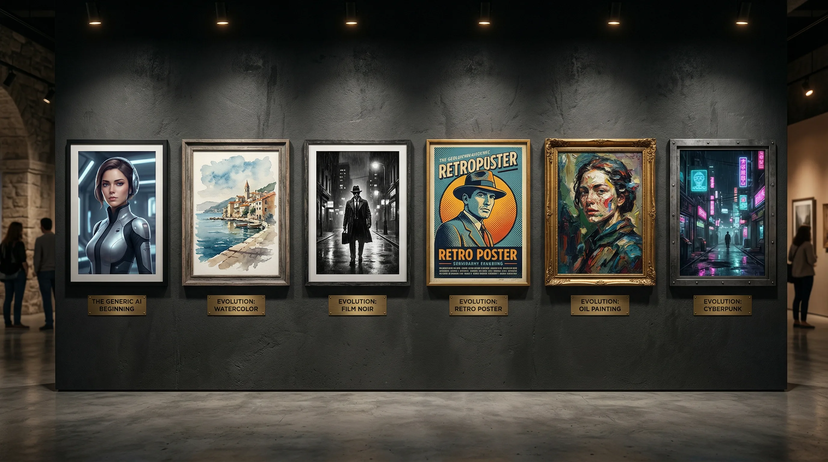
AI art style prompts are the key to producing images that don't look like every other AI-generated visual on the internet. If you've scrolled through an AI art gallery recently, you've noticed the pattern: hyper-detailed, oversaturated, cinematic-everything, with a dreamlike quality that screams "made by artificial intelligence." This homogeneous aesthetic is becoming so recognizable that it actually undermines the creative potential these tools offer. Here's how to break free and develop a visual style that's genuinely yours.
The "AI look" isn't a technological limitation — it's a default. When you don't specify a style, the model gives you its most common output. Overriding that default is easier than you think, but it requires understanding why it happens and knowing which levers to pull.
Why All AI Art Looks the Same
Three factors create the homogeneous AI aesthetic. Understanding each one gives you specific fixes.
The Default Settings Problem
Every AI image model has default parameters that produce a "house style." Without specific style direction, the model generates what it considers the most universally appealing image. That tends to be: high detail, vivid saturation, soft cinematic lighting, and a slightly surreal quality. It's the visual equivalent of a major-key pop song — technically pleasant, instantly forgettable.
The fix: override every default with a specific instruction. Don't just describe what you want to see — describe how it should look, including medium, lighting, color palette, and level of detail.
Popular Prompt Bias
Prompt-sharing communities have created an echo chamber. When one user discovers a prompt that produces impressive results, thousands copy it. The result: millions of images that use the same style descriptors ("hyper realistic, cinematic lighting, 8K, ultra detailed"). This shared prompt vocabulary converges all output toward the same aesthetic.
The fix: develop your own style vocabulary instead of copying popular prompts. Draw from art history, photography, and design — not from AI prompt databases.
The Oversaturation Effect
Models are trained on internet images, which trend toward high saturation and contrast because those images get more engagement online. The training data biases the model toward vivid, attention-grabbing visuals — even when you want something subtle, muted, or minimal.
The fix: explicitly counter the saturation bias. Include "muted tones," "desaturated," "low contrast," or specific muted color palettes in your prompts.
Style Techniques That Produce Unique Visuals
These four techniques, used individually or in combination, produce images that look distinctly different from the AI default.
Reference Specific Art Movements
Art history is your greatest prompt resource. Each art movement has distinctive visual characteristics that AI can replicate with surprising accuracy. The MoMA collection is an excellent reference for exploring art movements and their visual signatures.
Examples that produce radically different outputs:
- "Bauhaus poster design" — geometric, primary colors, structured composition
- "Art Deco illustration" — elegant lines, metallic accents, symmetry
- "De Stijl composition" — grid-based, primary colors, abstract
- "Ukiyo-e woodblock print" — flat color, defined outlines, Japanese aesthetic
- "Brutalist graphic design" — raw, bold, intentionally rough
- "Art Nouveau botanical" — organic curves, natural forms, decorative detail
- "Constructivist propaganda poster" — bold angles, limited palette, strong typography
Each of these references pulls the AI far from its default aesthetic into territory that feels intentional and distinctive.
Specify Medium and Technique
AI defaults to "digital rendering" because that's what most training images are. Specifying a physical medium changes everything about how the output looks:
- "Watercolor on rough cold-press paper" — soft edges, color bleeding, paper texture
- "Linocut print" — bold black lines, limited colors, carved texture
- "Risograph print" — limited color overlays, grain, slight misregistration
- "Cyanotype" — blue-and-white, photographic quality, vintage feel
- "Charcoal on newsprint" — rough texture, grainy, dramatic
- "Screen print with halftone dots" — pop art feel, visible printing texture
- "Pen and ink with crosshatching" — editorial illustration style
Medium specification is the fastest way to break the digital-render look because it introduces physical-world imperfections that AI's default aesthetic specifically avoids.
Control Color Palette and Mood
Color is the most overlooked style lever. Don't let AI choose colors — specify them:
- "Muted earth tones only: terracotta, sage green, cream, charcoal"
- "Duochrome: deep navy and bright coral"
- "Monochromatic blue palette, ranging from ice to midnight"
- "Warm pastels: blush pink, soft peach, lavender, mint"
- "High contrast black and white with single red accent"
Restricting the color palette immediately distinguishes your images from the default full-spectrum AI output. It also creates automatic brand consistency across multiple generations.
Mix Unexpected Style Combinations
The most original AI images come from combining styles that don't normally go together:
- "Art Nouveau infographic" — decorative curves applied to data visualization
- "Soviet propaganda meets pastel minimalism" — bold composition with soft colors
- "Cyberpunk ukiyo-e" — Japanese woodblock aesthetic with neon technology themes
- "Brutalist botanical illustration" — raw, industrial approach to natural subjects
- "Memphis design meets Victorian photography" — playful geometric shapes with formal subject matter
These combinations produce images that AI hasn't seen before — because they don't exist in the training data. That novelty is exactly what makes them distinctive.
Model Selection for Visual Diversity
Different models produce different default aesthetics. Some lean photorealistic. Others lean illustrative. Some produce vivid colors by default while others are more muted. Using multiple models naturally creates visual variety.
Fine-tuned or specialized models — trained on specific art styles, mediums, or visual themes — produce distinctively different output from general-purpose models. Exploring these specialized options opens up aesthetic possibilities that general models can't match.
Artifio's library includes image models from 20+ providers, each with its own aesthetic strengths. Access them all from one dashboard and discover styles you wouldn't find with a single provider. The model itself is a style choice — not just a quality choice.
Building a Distinctive Visual Brand with AI
Once you've found a style that works, document it rigorously so you can reproduce it consistently.
Create a visual style document that records:
- The exact prompt formula that produces your style (medium + movement + palette + mood)
- Which model produces the best results for this style
- Seed values and parameters for reproducible generations
- A "mood board" of your best generations as reference
- Variations for different content types (social media, blog, marketing) while maintaining the core aesthetic
Consistency in your unique style creates brand recognition. When every image on your blog or social media feed shares a distinctive visual language, your content becomes immediately identifiable — even in a crowded feed.
For more on creating consistent brand visuals, see our complete AI image generation guide. For hands-on prompting techniques, check our beginner-to-advanced prompt guide. And for e-commerce-specific applications, our AI product photography guide covers commercial visual creation.
Style Prompt Cheat Sheet: Quick References
Save these combinations for when you need instant style direction that breaks the AI default.
For Professional/Corporate Content
- "Clean editorial photography, neutral color palette, natural window light" — professional without being generic
- "Minimal line illustration, single accent color on white" — modern and distinctive
- "Isometric design, flat colors, no gradients" — tech-forward and clean
For Creative/Artistic Content
- "Risograph print, limited color overlay, visible grain and texture" — trendy indie aesthetic
- "Collage style mixing photography and illustration, textured paper background" — editorial and eye-catching
- "Cyanotype photogram, botanical subjects, deep blue and white only" — unique and memorable
For Warm/Personal Content
- "Soft watercolor, warm palette, intentionally imperfect edges" — approachable and human
- "Kodak Portra 400 film look, warm skin tones, soft natural light" — nostalgic and authentic
- "Hand-drawn sketch style, pencil on cream paper, casual and personal" — intimate and genuine
Start with these as foundations, then customize with your specific subject matter and brand colors. The style foundation ensures your images don't default to the generic AI aesthetic, while your customizations make them uniquely yours. Over time, you'll develop your own shorthand — style combinations that consistently produce on-brand results for your specific content needs.
Frequently Asked Questions
Why do AI images all look the same?
AI models have default aesthetic tendencies from their training data, and popular prompts get copied widely. Most users don't specify style details, so the model defaults to its most common visual pattern. Detailed style prompting breaks this pattern.
How do I make AI art that doesn't look like AI?
Specify medium ("oil painting on canvas"), reference specific art movements ("De Stijl"), control color palette ("muted pastels only"), and add imperfections ("slight paper texture, minor ink bleed"). The more specific your style direction, the less generic the result.
What are the best style prompts for AI images?
Reference specific mediums (linocut, watercolor, risograph), art movements (Bauhaus, Art Deco, Ukiyo-e), or general artistic styles. Combine unexpected elements for unique results: "Art Nouveau botanical diagram" or "brutalist typography poster."
Can AI create minimalist designs?
Yes, but you must explicitly prompt for it. AI defaults to detailed, busy images. Use prompts like "minimalist, clean lines, abundant white space, limited color palette, geometric shapes only" and negative prompts against detail and complexity.
How do I create a consistent visual style across AI images?
Document your style prompt formula, including medium, color palette, lighting, and mood. Use the same style prompt across all generations. Keep a reference library of successful outputs to maintain consistency.
Tap into visual diversity across 100+ AI models. Artifio gives you access to every aesthetic — find your unique style and make it your brand.